Coaching Homepage Redesign

Growth Warrior is a professional development and career coach based in the New York City Metropolitan area.
My client, Growth Warrior, wanted to rebrand their professional development coaching business from a "corporate", "buttoned up" approach to a more "heart-centered" approach.
In this case study. I’ll walk you through my process for working with the client to learn more about this pivot, and the assessment and redesign of the home page for Growth Warrior's website.
Before and After
Before

After

Stakeholder Interview
What was the business owner's vision?
I spoke with Lenore Kantor, Professional Development Coach and CEO of Growth Warrior, to better understand where her business currently stood and where she wanted to take her business with a heart-centered approach pivot.

Client collaboration
I performed an initial review of the Growth Warrior website, uncovering opportunities based on my knowledge of visual design best practices to improve upon the design, such as adding more white space, having shorter lines of text, and improving the accessibility of font sizes and contrast of color.
After this review, I shared my observations with the business owner, and I learned more about her concept for a heart-centered approach in her services (think Brene Brown), and what she sought to accomplish through her website. This would help me better understand direct and adjacent competitors and also conceptualize a design direction that would incorporate these ideals through the use of color, images, and typography.
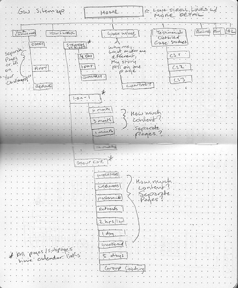
She provided me with a sketch of some ideas of what she wanted to present on her homepage:
-
Descriptions of how she works, along with the different types of services.
-
Growth Warrior's framework methodology.
-
Client testimonials.
Shown above is an ideation sketch provided by the client.
Visual Design Audit
What were some of the most pressing redesign needs?
I saw opportunities for improvement with the client's homepage, so I provided an audit of the visual design and areas that could have more visual impact.

Fonts, contrast, layout
I had been working on some background research for the client as part of my initial work, separate from a redesign, to help the client decide if she wanted to offer online courses. After presenting information that helped her make a decision, I suggested that I could help her evaluate her present website design. I developed a research and design plan to conduct a visual design audit and competitive analysis and devise the information architecture, wireframes, and a high-fidelity mockup for the redesign project.
The first part of my analysis was a visual design audit, which I conducted independently using my knowledge of visual design principles.
Overall, the feel of the website in its then-current state wasn't conveying the heart-centered approach the client was aiming for.
Homepage of the old website.
Key Takeaways


Poor accessibility
The small, thin weight of the white text and icons on the green and aqua color blocks and the black buttons on dark image overlays made these areas difficult to read.
Cognitive Load
The line length for the text blocks and alternating broken grid and grid patterns with a stretched out layout made text hard to read.

Visual Balance, Clutter
The organization of information and differing sizes of elements on the homepage looked jumbled. The large swaths of vibrant colors gave an anxious vibe.
Unmoderated Testing
How did my audit compare with what users saw?
I knew my opinion based on visual design best practices,
but what did users think? Did they agree?


Gathering quantitative data
After my audit, I conducted an unmoderated design test to validate my findings and see if there were any gaps or contradictions in my evaluation. I decided that an unmoderated test on UsabilityHub had the advantage of providing test participants with a 10-second test, to get their immediate response to the visual design and eliminating possible bias from the person who conducted the audit as well (me).
The design test showed participants the homepage for 10 seconds, after which they would choose from a menu of 20 words that best matched their impressions of the site.
Participants
-
N=19, self-recruited
-
18 in the USA, 1 in the UK
-
Ages: 20-60 years old
-
Timeframe: 1 week
Survey Results


Google Forms Survey
How could I get some qualitative feedback?
I couldn't do IDIs for more qualitative feedback on the site's content, but I could survey with free text answer options.

Anonymous reviews of the site
Time and budget constraints dictated that interviews were off the table, so to get some more qualitative feedback on the content of the site, I created a Google Forms Survey. Participants were asked to look at the live site and rate certain aspects of the design and content using a 1-5 Likert scale, and then provide more qualitative context for their answers in paragraph format.
Participants
-
N=9
-
In the NYC Area
-
Ages: 20-40 years old
-
Timeframe: 1 week
Key Takeaways


It was hard to read all the text on my phone, so I switched to desktop.
If there are services, I'd like to see pricing.
Is this for businesses or individuals?


"The paragraph font is thin and small."
"I'm having trouble reading the text in script."
Accessibility
People did note that the white text on the color blocks was hard to read, and it was evident from some answers that they couldn't see where services were located on the page. One person had trouble reading the script font in the header.

"A lot of focused reading is needed to learn about the company and what it does."
Cognitive Load
While one person said they could read the text, they along with others noted that the amount of text made it hard to read.
Gap: One participant noted that they would like to see pricing.

"I don't see what services are offered."
"I like the resources section."
Visual Balance
Feedback showed that people were having trouble parsing the information provided on the page. Services were located at the bottom of the page, and the target customer for services was unclear.
Competitive Analysis
How are competitors presenting their services?
I reviewed several competitors concurrently with the usability test and survey to see how their websites were designed, what their messaging was, and their branding.


Learning the business landscape
There are all kinds of professional growth coaches, and they range from buttoned-up and traditional to the more heart-centered, follow-your-passion style of professional development coach.
I reviewed professional development websites and presented my findings to the client. The analysis included professional coaching business websites and their social media channels.
The four outstanding approaches were:
-
Heart-centered/Follow Your Passion
-
Follow Your Passion/Luxury Focus
-
Traditional/Business Focus
-
Personal Empowerment/Channeling Emotion
The competitive analysis was presented as a means to help the business owner not only better understand how potential competitors marketed themselves, but also how she could stand out as someone offering a unique approach and different services that would attract the right customers for her business.
Key Takeaways
Building Trust
The majority of sites, regardless of approach, built rapport by showing a friendly profile picture of the person behind the company either in the header or at the top of the site. Professional profile photos of coaches help build client trust.
Clean design
Having more white space, larger fonts with contrast and colors suggestive of money, growth, and success communicate that this coach will get you where you want to go, without a lot of stress, and maybe even make the process fun.
Messaging
Coached offered content that provided clarity such as clear terminology, a statement on who their services were for, and what specifically they would do for clients in their coaching packages, including prices.
Growth Warrior's Unique Value Proposition


Having reviewed direct and adjacent competitors, it was clear that Growth Warrior had something unique to offer potential clients. There was a great opportunity to get Growth Warrior's heart-centered professional development message out there with a shift in branding and website and content design.
Moodboard
Ideating the shift in design
With information from the stakeholder interview, reviewing the competitors, and using color theory, imagery and typography, I put together a moodboard to show heart-centered design direction ideas to the client.

While the iconography and colors were vibrant and set the company apart from other coaches, I felt that using them more strategically and sparingly to align with particular services would create more impact for messaging. I encouraged a lighter palette, to give a feeling of elation and freedom vs. the heaviness of the darker colors used on the website. The business owner's Instagram served as an inspiration to tie the visual design together to the website for a cleaner, more energetic look and feel.
Low Fidelity Wireframes
Creating sketches and Figma wireframes
With the stakeholder interview notes, the client's sketch in hand, data from the surveys, and findings from the competitive analysis, I began to ideate by sketching up information architecture/sitemaps and wireframes.


Redesign Constraints
Work with what you've got
At the time of the redesign, the client worked with a graphic designer to create assets. I was to use what was already available on the website.


Screenshots, Photoshop and Figma
I took a lot of screenshots of existing icons and images to build a static prototype mockup for the visual design of the site.
While it's better to have all the assets beforehand for a high-fidelity prototype, the client was still in the process of developing her new vision for the business, and we had limited time to work together as my contract was coming to an end.
My intention was to give the client a "jumping off point" for the information hierarchy, layout, and look and feel of a new website for redesign inspiration.
High Fidelity Wireframes
How Did the New Design Help Users?
Below are some highlights of the redesign:

Script that is heart-centered in feel, and meets WCAG standards.
More concise paragraphs, with shorter lines of text
Improved visual hierarchy of text and elements.
More reserved use of color, to emphasize rather than overpower content.
A headshot and bio of the business owner. There were discussions around this - I would place this at the top.
Client testimonials, to build social proof and confidence of potential clients.
An easily accessible calendar to schedule a call and see public events.
Cleaner presentation of free downloadable resources.
Thank you for stopping by!
If you'd like to have a conversation about how I can help with your project, please contact me!